


What is the Future of Productivity Apps? (Part 3)
What is the future of productivity tools? Find out in today's video.
Hello everyone, Scott Friesen here at Simpletivity. I am very excited to have two of my productivity pals right here on YouTube with me for a future discussion of where productivity tools are going and maybe some of the features that we would like to see three or five years down the line.
Today, I have Carl Pauline and Francesco D'Alessio from the Productive Channel joining me for this discussion. Now, this is a three-part series.
First, we've talked about the past and how did we get started with productivity tools. What were some of the first things that we used many years ago?
If you'd like to see that, I'm going to leave a link to that video, and you can watch it on Francesco's channel. Next, we talked about all of the tools that we are currently using and why we choose to use them right now.
If you'd like to watch that video, I'll also put that link in the description, and you can watch that on Carl's channel. But for right now, we are talking about the future of productivity tools.
There’s no one that I'd rather be talking to than these productivity tool experts. So Francesco, I want to throw things over to you initially.
You seem to be in the know. In fact, I don't think I know anyone else who knows about the latest trends, the latest updates, what's happening in the world of productivity apps.
But beyond just the next week or the next month, what are some of the things that you think are going to happen maybe three, maybe five years from now? Perhaps some of the things that you would like to see.
Future of Productivity Apps
Ivan, I think that the next year's gonna be quite an exciting one for all of us. I think the focus is going to be on something called mod to the productivity applications.
We’ve seen it a couple of times in recent app releases like the likes of Monday, A table, Notion, and Coder. All are very popular modular app sets.
I think that's gonna be a huge rave in the next year because essentially what people want to do, because they've gotten so specific about their software, is actually build their own software. People want to put together these parts to formulate their own task manager or their own note taker or their own board or their own calendar.
That's what's gonna be quite exciting. So that's my sort of behind year predictions.
I think that’s gonna be a big thing. But it is sort of part and parcel of that I think that's gonna grow in the next three or four years and something that will basically learn from you.
They will basically map to your needs and essentially do errands for you. This is a weird thing that I've been thinking of over the last couple of months.
When you're doing your work, it understands you and is able to do micro errands based on your experience. For example, during your day you're doing projects.
You're not necessarily communicating with people, but you're maybe you're a developer, and you're building an application. But during that period of time, you're getting stuff coming in.
You’re getting new work, you're getting things, people you need to email. I believe that those micro errands will be solved by your own application.
Your application will actually be reaching out to those people, stopping you from getting distracted, and keeping you focused on it. So that's my sort of thoughts a bit out there, but I definitely think that that's gonna be where it's going.
When it comes to some of that, you know, that's smart, that anticipation of what you need to get done, do you see anybody right now who is dabbling in that or is maybe going in that direction? Yeah, there's a couple of applications that are using AI and machine learning.
I've seen a lot sort of in the Google space because that's obviously where it all begins. But I think that startups will start to join in.
I know A table is becoming a bit more interactive. Once they are able to add that sort of interactive side of elements.
Todoist, again, I know that Any.do have experimented with an assistant bot that's able to communicate with you and finish micro errands. But again, it's all very buggy at the moment.
I think over time things will just flatten out and become easier. There's always gonna be some trial and error to get these things worked out.
Speaking of Todoist, there are a few people on YouTube that know Todoist better than Karl. Todoist and Evernote, I should say, his tutorials are legendary.
But Karl, I'd like to hear from you whether it's regarding those two apps or really anything in the world of productivity. What do you see in the future or maybe some of the things that you would like to see?
Better Integration
I think we're gonna be seeing a lot more better integration. We saw this back at the end of the 1990s.
Apple and Microsoft were completely separate. I mean you could never have Microsoft Word on your Mac.
You had to use Chorus Work. Am I showing my age again?
But everything was just not compatible. In 2002, when I first came to Korea, I had a Mac.
I’ve never owned a PC. In those days in Korea, nobody had a Mac except really high-end designers.
Everyone was using Microsoft Office. I could never use those documents at all.
I’d say can you send me a PDF? They would say what's the PDF?
This is 2002. We all know what PDFs are today, but back then they didn't.
Then what happened, I guess Steve and Bill got together and shook hands and said look come on guys we've got to be compatible here. Once they all became compatible, I saw things changing rapidly.
You could use Microsoft Word on Mac. You could create your Microsoft Word on your Mac and you can email it to somebody who's got a Windows computer, and they could open the file.
Now I know today we're thinking, yeah, but just 15 years ago that was not possible. I saw what happened when we went totally compatible.
If you look at the productivity fields today, like Todoist for example, we've got integration with Dropbox, Google Drive, and something else. I can't remember, I don't use it, maybe Box I think.
But there's no Evernote link there, and I'm just, I really hope that the Todoist guys are watching this because I would love to get that integration. Todoist and Evernote so that when you drop something from Evernote, I can just drop it into my notes field, and it would just automatically generate the link direct to that note.
Oh, you can do it, but you're hacking it at the moment, right? I think that's what's, over the next few years, we're gonna see more and more of that as well.
I think Francesco is right. There's gonna be quite a lot of applications coming in who are going to try.
I'm not saying they're gonna succeed at this, but they're gonna try and be the be-all and everything. I think that's a very very tough call.
David Allen has always said that is a very tough call to get all three parts of a productivity system, the calendar, to-do list, and notes working together within one app. He says he's been trying to do it since the 1990s and never been able to do it successfully.
I think that's a tall order for most companies because you end up having to compromise. That's where the problem is with trying to be all and everything.
But I think if these companies can move together to having like a much easier or better connection between each other, integration with each other, I think that's where I will see the future going. I hope to see it going that way too.
I can generate a link in Evernote today, and I can paste that into my calendar, which is great because then I can create all the meeting notes, and I can click on the link, and it's there. I would just like to see that a little bit better.
I wouldn't say I'm a techie, but I understand technology to a certain degree. I work with people who are not interested in learning all that.
They just want to type something and send it. If these companies really want to get involved in that integration, that's the area they need to be looking at.
Tap tap, a button choice, Evernote, calendar, Todoist, whatever, click. That's all they need to have to be able to do.
At the moment, I have to go, copy note link, copy paste it into... I mean I can do that, I don't think there's a problem there.
But I'm thinking of the people who are not really into technology. They're not gonna do that.
So if they really want to get our integration in, that's what I think the future of productivity apps is gonna go. Yeah, I think it's really...
Final Thoughts
Interesting that over the years we've seen so much integration between the apps. It’s hard to find a productivity app worth its weight that doesn't integrate with at least ten other services.
Now it may not be the services that you want, but it may be ten popular services or other things that other people are using. I often cringe when I see a tool that proclaims that they're the all-in-one solution.
They're gonna do everything for you because I know we've all had first-hand experience of getting our hopes up, and then we get to one aspect or maybe a couple of components of that system. You're just like, you know what, so many other apps do this better than what you do.
Hopefully, we have some stronger integrations or maybe different types of integrations so that we can get the most of both worlds. To your comment Karl about David Allen still not being able to figure it out to get the right systems together.
I think that's a great highlight of the personal and personal productivity. We all are a little different.
We all work a little differently, so there isn't just one solution. Hopefully, we can find
that right mix.
Francesco, with your comments about some automation and some intelligent AI, I'm really hoping for that day as well. I'm eager for that future because I feel that we're still not quite there yet either.
Although we have a number of tools that proclaim to have smarter notifications, we now all have email that has some type of filtering or we're gonna put things up higher than others because we know what you're reading. I think we all recognize that they have their faults.
They have their drawbacks. I'm looking for that day where we have some smarter notifications, whether that's on our wearable devices when we're out and running errands, or whether that's in front of a desk computer, that our systems do get to learn from us that much better.
I just have one question on that. Sorry Scott, I just had one question.
One of the areas I thought about that myself is that AI and all that stuff. One of the things I think of is if AI is starting to complete tasks for me, I'm gonna feel like I have no control over my life.
Some robot is a bot is gonna be doing things I should be doing, and maybe because I got a human brain logically, I think no no no no. I don’t want to be doing that today.
There's a reason because I'm communicating with a human being, and if I send that at five o'clock in the morning, they're gonna be very angry with me. Just wondering about that control side of that because one of the things I find is when I see everything that I want to do and I choose when I'm going to do it.
That's how I feel in control. But if a bot is making decisions based on my past actions, it doesn't know what my future actions are gonna be or what I'm thinking right now.
The AI side of things is interesting to me, but I'm just wondering where is it actually gonna go. It does sound a little scary at times.
It almost sounds a little bit like 2001: A Space Odyssey. I’m sorry Carl, but that is not your number-one priority.
Have AI telling you what you should be doing today, but are you really sure you want to complete that task right now? I'm sorry Carl, but you have other important things to accomplish.
Exactly, myself impersonating, that's good. I want to thank both of my guests, Francesco and Carl.
Next, I'd love to hear from you. What do you think the future holds for productivity tools and productivity apps?
What are some of the things on your productivity wish list? Be sure to leave a comment below and tell us all about it.
Both Carl and Francesco are going to be reviewing these comments and responding as they come in, so we're looking forward to hearing from you. Once again, I want to thank my guests.
We covered a lot of ground, and I mean that literally. Carl from Asia, we’ve got Francesco from Europe, myself here in North America.
Yeah, we really did stretch the globe for this one. A reminder if you'd like to see part one, our productivity past, or part two, our productivity present, be sure to visit Carl at Carl Pauline and be sure to visit Francesco at the Keep Productive Channel.
Remember, being productive does not need to be difficult. In fact, it's very simple.
How to Help Friends to Be More Productive (3 Easy Tips)
How can you help a friend or a colleague improve their productivity? Let's find out in today's video.
Hello everyone, Scott Friesen here at Simpletivity, the place to get more done and enjoy less stress. And you know, I'm always looking for your comments and your suggestions as to what you would like to see next here on the channel.
Recently I got a great suggestion from Neil. Neil says how can I help other people get on board with productivity methods when they don't have much of a system at all?
Neil, I think that is a fantastic question and something that a lot of us can relate to. You may have a friend or a co-worker who is always complaining about how busy they are and how they can't get all of the things done that they want to get done.
So in today's video, I'm going to offer three suggestions on how you can help others improve their productivity. So when you want to help others with their productivity, here's my number one suggestion—don't share everything.
Dont Share Everything
Sometimes when we have found a method or perhaps a productivity tool that works really well for us, we get so excited. And as a result, we want to share all of the benefits and all of the features of that particular application.
However, there can be a negative consequence to this approach. The person who is listening to us may feel overwhelmed by all the information that they are receiving.
So instead of sharing everything, I recommend that you share one key highlight. What's the number one benefit that that system or perhaps that tool has been to you?
Just focus on that one key benefit and share that with the person that you're speaking to. In this way, there is a much greater chance that they may remember the things that you've shared and they may want to come back to you for further information.
Now my next suggestion relates to productivity tools or applications. Once again, we may get very excited about the tools that we use to help us stay productive and as a result, we may send out invitations to other people around us.
However, this may actually backfire. When someone else receives an invitation to a website or to an application that they know nothing about, they are less likely to actually install or even try it out.
Worse yet, they may actually be offended by your invitation when they don't have any prior knowledge about what it actually does. So instead, I recommend that you stay focused.
Stay Focused
Stay focused on sharing one key benefit. Show them how this tool makes managing your calendar so much easier.
Show them how this particular app makes capturing notes that much simpler. As a result, they may actually ask or request an invitation or for you to send them a link.
So don't send any unsolicited invitations to others. Wait for them to make the request of you.
Show Patience
Now my third and final suggestion for you helping your friends or colleagues with their productivity is this—don't get frustrated. It's important that we show patience as we extend an arm and help those around us.
I know it can feel frustrating to see other people struggle with their to-do list or to miss deadlines on a regular basis. But if we show patience, it's much more likely that they will want to continue the conversation and ask further questions.
Remember, it didn't just take you a few hours to find the perfect workflow or the right productivity app for you. Chances are it took several weeks or perhaps even months to find the ideal system for yourself.
And your friend or colleague may need just as much time to find the right individual system for them. So let's show patience as we share our knowledge about productivity with others.
So I would love to hear from you next. What has your experience been with sharing productivity methods or productivity tools with others?
And of course, I'd love to hear your suggestions as well as to what you'd like to see next here on this Simpletivity channel. So be sure to leave me a comment down below.
Thank you so much for watching. If you liked this video, be sure to give it a thumbs up, leave me a comment, and don't forget to subscribe.
And if you'd like to see more Simpletivity, you can watch another video right here. Remember, being productive does not need to be difficult—in fact, it's very simple.
5 Things I Don't Like About Google Apps
There are just some things about Google that I don't like. Hello everyone, Scott Friesen here at Simpletivity, helping you to get more done and enjoy less stress.
If you're already a subscriber to the Simpletivity channel, you know I talk an awful lot about a variety of Google products. For the most part, I'm very pleased with Google, but you know what—there are just some things that get under my skin.
So today, I'm sharing with you four different products: Gmail, Google Calendar, Google Keep, and Contacts. I'm sharing with you things that I just can't stand—the things that I wish Google would improve upon.
Now just before I start, I would love to hear from you. If you see a great workaround to any of the problems that I'm going to point out, I'd love to hear from you, so be sure to share that in the comments below.
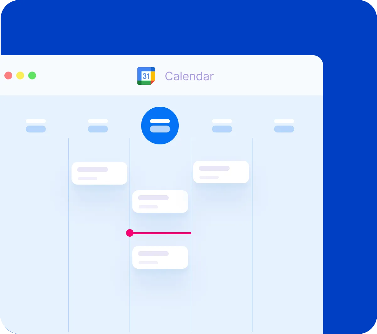
Google Calendar
Let's get things started off with Google Calendar, and I've got a sample calendar here—something that I use on a daily basis. Google Calendar is really my home base when it comes to my own productivity.
As you may know, I often use all-day tasks for my most important tasks, but of course, Google has reminders built right in, which is very helpful. But here's pet peeve number one.
Here on Friday and Saturday, you can see that I've got two different reminders here, and they show up at the top, which is great. Actually, I just have the one here on the Friday remember to do this thing.
But here's my pet peeve—I've got three reminders today, and there is no way for me to auto-expand all three. What Google Calendar will always do by default, if you have more than one reminder on a single day, is it's going to group them all together like this.
This really, really bugs me. In fact, I probably create fewer reminders as a result because of this.
I want to see all three of these reminders, just like if I had more than one all-day task, but I can't do that. Or at least I haven't figured out how to do that.
I always have to click on this and then take a look at those individual reminders down here. The exact same thing goes for the mobile experience as well.
So I wish there was a setting somewhere—I wish I could change this. If you know of a workaround, I'd love to hear from you.
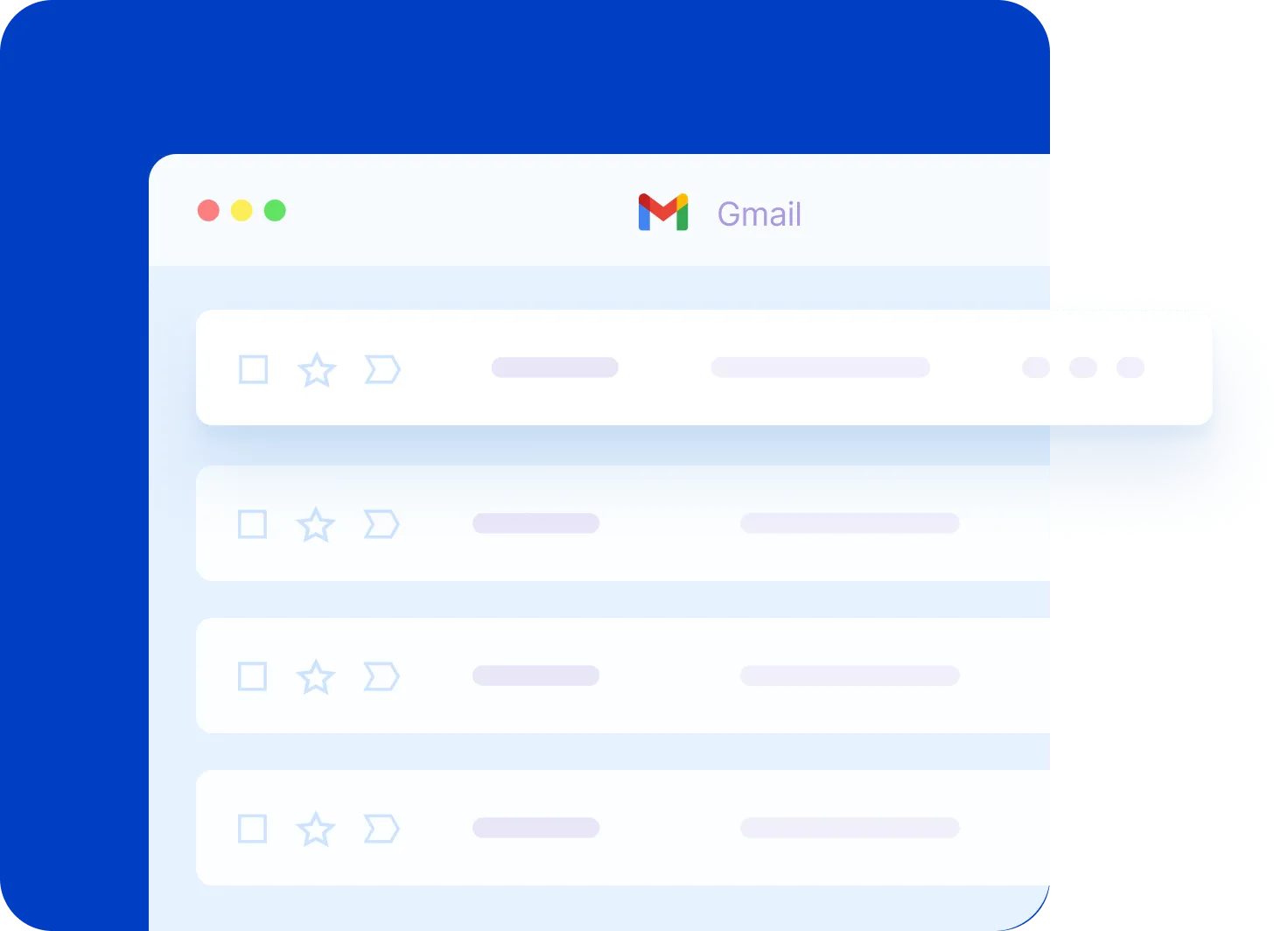
Gmail
All right, let's move on to Gmail—something that again I use on a very regular basis. If you use Google products, chances are that you use Gmail as well.
Recently, Gmail had a facelift with a number of improvements but also some changes. Now, one of my favorite things in the previous version of Gmail was that when you hovered over an email address just here from your inbox, you got to see some of that information.
You got to see a profile picture, a name, and so forth, and they give you a few helpful icons here, right? If I want to send an email to this person, if I want to schedule an event, a few other helpful things as well.
But in the previous Gmail, you could see there was an additional link where you could see all of the emails which this individual had sent to you. If you wanted to quickly see all of the emails which this sender had sent to you, it was just one click away.
I can't do that anymore. This is going to start a new email to this user, and in fact, this icon is going to do the exact same thing—just send an email to this user.
But what I used quite frequently was this additional link, and no longer can you go back to the classic Gmail. This additional link allowed me to see all of the emails which I've received from that person.
Now what I have to do is essentially copy and paste their email address, put it up here in the search, and then that's going to bring back everything here in my search results. It's a bit clumsy, and I wish that they would bring that back.
Now there's one other pet peeve that I want to share here within Gmail, and that has to do with when you are creating a message. When we are creating a message here in Gmail, not a lot has changed here in the edit box as you're crafting a new message.
But something which has changed is down below here with the formatting options. Often, by default, I have the formatting options available here, right?
I want to change the font; I'm often bolding certain items of my text, or maybe I want to add a bullet point or realign some things. But what I really dislike about this area here—and you probably can't take full appreciation of it because I don't have a lot of text in here right away—but let me enter down here a little bit—there we go.
This is my pet peeve—I'm often crafting an email, and look what happens. This formatting bar here is floating on top of the email.
So often as I'm writing here, you can see how my signature is being hidden. Often as I'm replying or writing an email, it's hiding some of the text that either I've written or that was later on in that particular email.
In the previous version of Gmail, this was just on top—it would sort of expand this area so it would appear directly above this area. But now it floats on top, and it seems to squish everything in here.
I've got to go scrolling back and forth depending on where I am to see what is going on. This may not be the best example that I'm showing you right here, but you can even see some of my additions here—I've got assistant.com here, I've got Grammarly setup—it's kind of hiding that as well as it's floating over top.
I wish they would go back to just having this as a part of the console. I want to turn it on and off still—I mean, I want to still have that capability—but I don't like this floating option here.
Well, let's stick with a contact-related pet peeve of mine, and that has to do with Google Contacts. If you're using Gmail, chances are you're using the contacts, and of course, it's very easy to add and have Gmail automatically add your contacts here.
But probably my biggest pet peeve is just the default view here, in that I only have limited information. I've got the name, I've got the email address, and I've got a phone number, but that's it.
I can't change these columns in any way—I can't add a company name, I can't add a city, I can't add an additional number. Maybe I want both a business number and a mobile number present on this page.
If I want that information, I need to click on that person and then find that information down below. This is not exactly what I'd like to see—I’d like to have more flexibility here within Google Contacts.
If you know of an extension, if you know of something that enhances Google Contacts, again, I'd love to hear from you. Be sure to include those recommendations in the comments below.
Last but not least, my fifth pet peeve has to do with Google Keep. Now, I love the flexibility of Google Keep with the different types of notes that you can create, but that also is where this pet peeve comes from.
When you go to take a note, and let's say you want something with a checklist like this sample grocery list here, you have to make that choice upfront. What I'd like to do is to be able to add some additional text within a checklist, but currently, I can't do that here at this stage.
If I start taking a note, I can't just add a checklist at this point. I'm gonna have to delete this or close this note and select New List.
Once I start adding this checklist here, if I want to add some additional text below this checklist or above the checklist, I can't do it. I can't do it—I have to make that choice upfront.
So either your note is a checklist, or it is a text-based note. Now, you can add text to an image, and if I want to add further text to this, that's absolutely fine.
But I really wish that I could combine a checklist with additional text information and maybe even a picture as well. So those are some of my pet peeves within my most-used Google products.
Next, I would love to hear from you. What are some of the things that bug you the most when it comes to using your Google apps?
Whether it's Gmail, Google Calendar, Google Keep, Google Contacts, Drive, Maps—I don't care what it is—share with me and share with others what your biggest pet peeves are. Thank you so much for watching.
I'm looking forward to your comments, and I hope you subscribe right here to the Simpletivity channel. Remember, being productive does not need to be difficult. In fact, it's very simple.
How to Plan Your Work Day (Set yourself up for less stress)
Shh I've got a question for you. What would it feel like to have a stress-free workday?
What would it feel like if you are absolutely in control of everything that was on your plate? Now I can't speak for you, but I can speak for my clients—it feels great.
It feels absolutely wonderful to be in control of your calendar, your to-do list, and all of the commitments that you have on your plate. Now don't get me wrong, I'm not suggesting that you're not a high-performing professional.
You may be a business owner, an entrepreneur, or maybe you manage many other individuals. But you probably clicked on this video for a reason.
You've probably clicked on this video because you're looking for a way to improve your productivity. You're looking for more control in your workday.
Challenge
Well, I want to help you do just that. So you're probably wondering, can I help you feel more in control of your day in just a short video?
Well the answer is yes, but I'm going to ask something of you. I'm going to ask for your commitment to actually put these ideas into practice.
You know you can watch countless YouTube videos. You can read endless time management books and other blogs on the subject of productivity.
But if you don't put things into action, you're not gonna see those results. So here's my challenge: tonight I'd like you to spend five minutes, just five minutes, planning out your day tomorrow.
I want you to sit down with your calendar, your to-do list, and any other deadlines or commitments that you have coming up. And I don't want you to spend any more than five minutes with them.
Conclusion
In fact, to make sure that you stay within that deadline, I would encourage you to take out your smartphone and set a timer for five minutes. Not only will it keep you within that timeframe, it'll actually make it a little more fun.
Can you challenge yourself to spend just five minutes with your to-do list? Remember, if you fail to plan, plan to fail.
So the choice is yours. You can do the same old thing that you've always done, or you can try something new so you can be in control.
And I'm only asking for five minutes. Five minutes to plan your day ahead and set yourself up for success.
Now once you've fulfilled this challenge, I'd love to hear from you in the comments below. And I'm sure there's some of you who have already applied this technique as a part of your day today.
Thank you so much for watching. I hope you subscribe right here to the Simpletivity channel.
Give this video a thumbs up, and I look forward to your feedback in the comments. Remember, being productive does not need to be difficult—in fact, it's very simple.
The Worst Productivity Advice You Will Ever Hear
What's the worst piece of productivity advice that I often hear? Find out next.
Hello everyone, Scott Friesen here at Simpletivity helping you to get more done and enjoy less stress.
And recently here in the YouTube comments, I was asked what is one piece of productivity advice, Scott, that we often hear but you don't agree with.
I thought that was a fantastic question so I thought I'd share my answer with you today.
One of the most famous productivity quotes comes from Benjamin Franklin and he famously said, don't put off until tomorrow what you can do today.
Now we often hear this piece of advice as it relates to procrastination that we shouldn't be putting off important things.
If we are able to do them today, then we should do them and not put them off until tomorrow.
But one of the things that I hate about this particular quote is that it's often used in the sense of hustling or just working harder, just bearing down and grinding it out.
Think about it for a second. There's an unlimited list of things that you or I would like to do today.
There's probably about 100 things that I would like to accomplish today and I could probably get through most of them if I ignored my family, if I ignored my health, if I ignored my diet, if I ignored my friends and neighbors.
I could accomplish a whole lot more if I just shut everything else around me.
The problem is is that leads to burn out, that leads to stress and it certainly doesn't win me any favors in my circle of friends.
So I think we need to put a pause on this particular quote and think about when it's appropriate to defer things to another day.
And whether that's work-related or perhaps that's something in your personal life, it's important for you to be able to push something to the future when it's appropriate.
Now in order to debunk this quote from Benjamin Franklin, I'm gonna use Benjamin Franklin.
That's right, I'm actually gonna use something that he is also famously known for.
In his autobiography, Benjamin Franklin included his regular daily schedule.
He outlined the things that he typically did in a day, everything that he did from when he got up in the morning at 5 a.m. all the way until he retired at 10 in the evening.
And what I love about reviewing his schedule is that if you look at his post-work activities, when you look at what he did after 6 p.m., it was very much un-work related.
In fact he reserved this time for things like music or diversions or good conversation.
He wasn't just working all hours of the day tucked up in an office somewhere.
No, he made sure that he spent some time with the people he loved, the people he cared about and other pursuits, including the arts.
So how does this apply to us in our day?
Well of course Benjamin Franklin didn't have email. He didn't have his smartphone going off every other minute.
But I think we can apply some of the things that Benjamin Franklin taught us.
Whether you work in an office, whether you work at home, whether you work for yourself or for a large corporation, I think it's important that you set a particular deadline, a particular time of day where you will relinquish your work activities.
I know most of us don't have a finite end of workday.
It's not like the old Fintstones cartoon where a bell is rung and everybody goes home.
You're probably even encouraged to work most of your waking hours.
But regardless of your working situation, I encourage you to select a particular end of workday and do your best to stick to it so you can reserve time for the people and also the pursuits and hobbies that are most important to you.
Don't just get caught up in the grind of accomplishing as much as you possibly can today because you're only going to lead yourself into a spiral of burn out, increased stress and poor performance in the long run.
So let's learn something important from Mr. Benjamin Franklin.
Not that we need to jam as much as we possibly can in a given day, but it's important to finish the day.
Finish our work at a particular time so that we can have time for family, friends and other personal pursuits.
Now I'd love to hear from you. What type of productivity myths or common productivity phrases do you dislike and do you think we should debunk?
And also I'd love to hear what you think about Benjamin Franklin's schedule.
Do you think some of the things that he talks about, some of the things that he did so many years ago are still applicable today?
I'd love to hear from you in the comments below.
Remember, being productive does not need to be difficult. In fact, it's very simple.
The 7 Best Books I Read this Year
I've read a lot of books in the past year, but which ones do I actually recommend? Let's find out next.
One of my favorite ways to unwind at the end of the day is by reading a good book. I do this almost each and every night.
This year, I've read about 20 to 25 books in total, but I certainly wouldn't recommend each and every title. In today's video, I wanna share with you my seven favorite books of the past year, and I've broken it down into different categories.
Everything from time management to sales to even a piece of fiction that I should've read many many years ago. Just to let you know, not all of these books were published in the past year.
These were books that I read for the first time in the last 12 months. If you'd like to learn more about any of these books, I've provided links in the description below.
So let's get started with surprise, surprise, time management. The first book on this list has quickly become one of my favorites, When, by Daniel Pink shows us the scientific secrets of perfect timing.
This has quickly become one of my favorite time management books of all time. In this book, author Daniel Pink shows us why when we do something is just as important as what we are doing.
For example, do you know that you should be avoiding a large number of activities between the hours of two and four p.m.? In particular, don't visit a hospital during those two hours.
Do you know that you should be starting many of your major goals on things like your birthday or maybe an anniversary? Don't just wait till the beginning of the year.
This book is jam-packed with great ideas that you could implement, not only for yourself, but also with your business. I've read a number of Daniel Pink's other works and I was very impressed.
But I have never been this much more engaged with his work than when I read When. So if you're a fan of time management or personal productivity books, you're gonna wanna pick this book up.
Never Split the Difference
Now the second book on my list, I'm gonna put into the category of sales, but really it goes so much further and beyond. Never Split the Difference by Chris Voss is all about negotiation.
And whether you are a salesperson or whether you have a conversation with almost anyone, you're gonna benefit by this book. In Never Split the Difference, Chris Voss talks all about high stakes, but also low stake negotiations.
Everything from selling a product to having a conversation with your spouse or maybe you want to get your kids to do something for you. Anyone can benefit from this book.
I found myself re-reading a number of the chapters, because whether I'm out to buy a new vehicle, or perhaps sell you a service, the tips in this book are most valuable.
Building a Story Brand
The third book that I read this year that I would recommend, I would put into the category of marketing. Of course, there's a difference between sales and marketing.
For this book, I've chosen Building a StoryBrand by Donald Miller. Most of us are trying to clarify our message.
As a business or an entrepreneur, you want someone to understand immediately what problem it is that you are trying to solve. And for many of us, we tend to scramble up that message within our website, within our social media, maybe even right here on YouTube.
Donald Miller gives you a fantastic template that you can replicate for different products or different businesses as a whole. In fact, he shows you why almost every single major motion picture follows this exact same story to clarify their message.
If you want to get clear with what you are trying to sell or the service you're trying to provide, I recommend you pick up this book.
Philosophy
During the course of my year, I try to pick up a book that is related to philosophy or perhaps psychology. And in this category, I would have to pick 12 Rules for Life by Jordan Peterson.
Both this book and Jordan Peterson are somewhat controversial, and I can't say that I recommend everything in which Dr. Peterson talks about within this book.
But, if you are looking for someone to challenge you and get you thinking about the different complexities that we face in this life, you're going to enjoy the 12 Rules for Life.
I particularly like how he brings in data, and as a clinical psychologist, how he brings in his own research with the research of others to try and defend his arguments or prove his points.
This wasn't an easy book to read, it certainly wasn't maybe the easiest thing to read before bedtime, but once in a while, you need a book to challenge you and that's what I liked about the 12 Rules for Life.
Selfhelp
My fifth recommendation on this list, I'm gonna have to put into the category of self-help. I know, you may not be wild about that title just like I'm not wild about that subject area, but let's be honest, we still use it.
You're still gonna find a self-help section in your local bookstore. For this category, the book that made the biggest difference in my life is The More of Less by Joshua Becker.
Joshua Becker runs a very popular blog all about minimalism, something that you've maybe heard a lot more frequently in the last few years about living with fewer items, having less clutter in your home.
I really appreciated his philosophy, and the things that he talked about in the book, because although most of them are related about the home and physical items, I think a lot of what he talks about is in line with what I teach and talk about right here on Simpletivity, that less really is more.
And by keeping things simple, you have an opportunity to work at your productive best. If you would like a taste of the minimalist lifestyle and get some great ideas about how you can purge some of that excess, I'd recommend The More of Less by Joshua Becker.
Biography
A year of reading for me wouldn't be complete without reading at least one biography. And this year, the one that I would recommend is Elon Musk by author Ashlee Vance.
This biography has been out for a number of years and it's been at the top of many bestseller lists during that period of time. I finally got around to reading it and I'm glad I did, but maybe not for the reasons that you think.
Yes, it's very impressive to see his life story and to see how many different things that he has accomplished, and really started to transform the way that we work and the way that we may be exploring other worlds.
But one of my takeaways from reading this biography is how we treat one another, and I have to admit, I walked away with some of the similar feelings I had after reading the Steve Jobs biography.
Both of these men have done some amazing things in their lives, however, at the cost of many other lives. And no, I'm not talking about death or murder, but it's very apparent that both of these men have been very ruthless with their relationships, both with the people closest to them including marriages and estranged children, but especially the people that work for them.
And although they both have very, very loyal fan bases, it often gets me to thinking about how we treat one another and is it worth it? So that's just my personal take on this particular biography.
But if you do want a fascinating look at a fascinating person, you may wanna check out the Elon Musk biography.
Fiction
Well, we're almost near the end of my list, but before I reveal my seventh and final recommendation, I wanna hear from you. What were your favorite books from the past year?
They don't have to have been published in the past year, but of all the books you read in the last 12 months, which ones were your favorite? Be sure to tell me in the comments below.
For my seventh and final selection, I have to go with a work of fiction. Something that I actually don't read a lot of. You probably already noticed that by hearing my six previous recommendations.
But when it comes to my favorite book in the genre of fiction, I'd have to go with The Hitchhiker's Guide to the Galaxy. I know, you might be surprised by that, 'cause I actually like science fiction, and this is already a classic.
But The Hitchhiker's Guide to the Galaxy by Douglas Adams combines two of my favorite things, science fiction and humor, and there are healthy doses of both throughout this classic.
So if you have not yet read The Hitchhiker's Guide to the Galaxy, you might want to do so in the coming year. There you have it, my seven favorite books from the past year.
I hope that you make time as a part of your day to read each and every day. If you wanna get the most out of your business, if you wanna get the most out of your life, you need to continue to learn, and books are a fantastic way to do so.
Thank you again for watching today's video. I hope you subscribe. Give this video a thumbs up, and don't forget to tell me your book recommendations in the comments below.
Remember, being productive does not need to be difficult. In fact, it's very simple.
Thank You and Happy New Year!
Hey everyone! Scott Friesen here at Simpletivity.
And as we head into the holidays, as we head into the very end of the year and the start of 2019, I wanted to take just a moment to express my thanks to you.
Thank you for supporting the Simpletivity channel, for all of your comments, for all of your questions, for attending the live streams, for participating in the RESET Productivity Boot Camp.
Any way, shape, or form, I want to express my thanks to you. It's hard for me to believe that a year ago we had something like 8 or 9 thousand subscribers.
And we are now on the verge, at least at the recording of this video, we're on the verge of exceeding 40,000 subscribers. But let me be honest, it's not about the subscribers.
It's not really about the numbers or the number of views. It's the ways that I get to interact with you, and I really appreciate all of your questions and comments.
I still try to do my best to read every single one of the comments. So, as we head into a new year, I wish you the best, Happy New Year!
I hope you have a fantastic 2019. And I'm looking forward to even new bigger and better videos in the coming year.
But just before I sign off, I've got a question for you. I feel like we've built up a community here.
You're more than just a viewer, I consider you a friend. I consider you a contemporary, a partner as we seek ways to be more productive and make the best use of our time.
So the question I'd like you to help me answer is what should we call this community? I've named my business Simpletivity.
But should we name ourselves something? Or would you like to be named something or referred to as something?
I'm not saying that we have to do this, but I want to throw that out there to you. Maybe it's something fun that you can think about and you can share with me in the comments below.
With that, I wish you a Merry Christmas, a Happy Holidays, and a Happy New Year! Remember, being productive does not need to be difficult. In fact, it's very simple.
Everything You Need to Know About the RESET Boot Camp
Just a few days ago I opened up registration for the reset productivity bootcamp so in this video I wanted to answer the most frequently asked questions about reset I'm going to be using the five W's who what when where and why so you have everything you need to know about the reset boot camp number
What is Reset
one what exactly is reset well this is a four week online course where I teach you directly how to get the most out of your day whether you're dealing with distractions or interruptions perhaps you want a better way to prioritize all of your projects and tasks and most importantly how to create the optimal productivity system for you we are going to learn all of that within the reset productivity boot camp
Who is the Reset Boot Camp
who exactly is the reset boot camp for well I've had a variety of different professionals attend the reset boot camp over the last year and a half we've had
everyone from bookkeepers accountants real estate agents small business owners
entrepreneurs a wide variety of professionals it doesn't matter if you work for yourself if you work from home or if you work for a large organization this boot camp is all about transforming the way you work so you can work at your productive best if you don't believe me
What is the Reset Boot Camp about
you don't have to take my word for it here are just some of the things that passed reset alumni have said about the reset productivity boot camp I especially like what Gary had to say today's one hour reset webinar saved me approximately two hours this very afternoon something I hope you already know about me is that I'm all about
actionable tips and in each and every one of our live sessions I'm giving you actionable tips and weekly assignments you get a little bit of homework just to make sure that you follow through with this program make the differences that you want to see in your work day
Where does the Reset Boot Camp take place
Where does the reset bootcamp take place well it's wherever you want to be this
Is a online course but it is live that's right there's no pre-recorded videos with the reset productivity bootcamp I host four live webinars through the duration of the program so whether you want to take this from your home office if you want to do it at work and remember each
And every one of the live webinars will be recorded so if you can't make everyone live or only some of them live you can catch up and you can watch those videos in fact those of you who register for the reset productivity
bootcamp will have access to those videos for a full year once the course begins when does the reset boot camp When does the Reset Boot Camp take place
Take place well the course kicks off Wednesday May 1st and it will run every Wednesday throughout the month of May it's a one-hour webinar where you join me live and the other cohort participants you get to ask me questions directly but perhaps more importantly
I am teaching you directly as I share my screen as I share real-world examples and you get to ask questions and participate along with other students as
a part of the reset productivity boot camp so again that's May first starting things off each Wednesday throughout the month of May and perhaps the most
Why should you consider the Reset Boot Camp
Important question that you're wondering is why why should you be considering the
Reset productivity boot camp well as I said before this is very much unlike any other course you've probably taken before this isn't something that you can just click through over the course of a weekend know you get to work with me directly
And get direct access to me throughout those weeks you'll be invited to a private Facebook group where you can interact with myself and ask questions in between the webinars and you know if you're wanting to make some really big changes in your work day
It's important to have someone you trust it's important to have you it's important that you have a coach to guide you along the way that's one of the reasons why I only do this two times a year once in the spring and once in the fall so if
Register for the Reset Boot Camp
you would like to learn even more or register for the reset productivity boot camp I encourage you to visit simple tivity dot-com slash reset or you can click the link in the description below now we are still in the middle of early registration so you have an opportunity to save 40% off the regular price but registration is only open for a limited amount of time before the course begins May 1st as always
Remember being productive does not need to be difficult in fact it's very simple
I Can't Believe This Is My New Desk! (Workspace Tour)
Hi everyone, Scott Friesen here at Simpletivity, helping you to get more done and enjoy less stress.
And today, I'm doing something just a little different.
Today, I wanna give you a tour of my actual workspace.
Now, you may be familiar with this background here. This is where I record my monthly webinars. This is where I host the Reset Productivity Bootcamp.
If you've ever attended any of my online training, this is where you're probably used to seeing me, but this isn't actually where I do most of my work.
No, I do most of my work at a different location in my home. I do have an office location and just two weeks ago, I purchased a brand new desk.
So I wanna give you a tour of the new desk, give you reasons why I chose this particular desk and I'm hoping you can maybe help me finish off organizing this desk.
You can choose where I get to put certain items 'cause I'm looking forward to your feedback.
So, let's head upstairs and let me show you my new desk.
Desk Tour
So, here it is, my brand new desk.
And I'm sure the first thing that you're saying is, that doesn't look like a desk.
Well, no, it's a converting desk, sometimes better known as an armoire desk. It looks more like a chest, right? It looks more like a dresser.
Well, I'm big on saving space and so I purposely purchased such a converting desk so not only can I save space, but I'm gonna show you how I can easily pack up shop and leave my work behind at the end of the day.
So, with any converting desk, all you need to do is pull on one of these handles and this desk part folds out.
I've got plenty of space for my laptop, room for a notepad, a piece of paper. This is where I do all of my video recordings, as well.
One of the reasons why I chose this particular model is that, as I close this up, for example, you'll see that it actually has some supporting arms here on the corner that fold out, right? The mechanism is built in.
I wanted to make sure that I had a desk that was sturdy enough because I'd seen other folding desks before and sometimes it was just, sort of, a very thin hinge. That was the only thing that was keeping this part here, but this is more than sturdy enough for my laptop, for my big microphone that I use for recording my videos.
Lots of space here for a notepad and some additional paper. But this is more than enough space for me to get the work done that I need to do.
The other reason why I chose this particular model is that there's ample room for storage space. You can see here, I've got room for my tablet there, I've got some scrap paper there, and in fact, I've got a lot of empty space and this is where I'm hoping you might be able to help me out.
Where and what should I be putting into these different slots here? I don't usually keep a lot of mail or paper.
Now, got some of my favorite candy. I'm a big Skittles fan there, in the background, but I'm still not sure what exactly I should be putting into these four slots.
I've got a few small pull out drawers here where I can leave some knick-knacks. I only have a few things in there, a charging cable and a USB drive. But, plenty more storage down below.
So let me just fold in, put my laptop back inside. Let me fold up the desk here.
And here on the front, you can see, I've got two drawers and two cupboard drawers.
Now, one of the disadvantages of this particular desk is that when the desk itself is folded out, it makes these drawers essentially inaccessible, right? I can't access these when the desk is folded up, but that's why I purposely put in things that I don't need very often.
Here I have a number of business cards in this particular drawer. I'm only needing, you know, one or two writing utensils at a time, so I keep those on my desk. I can leave my extras in this drawer here.
But down below, I've got much more space. Down below here, I've got mostly my recording equipment for recording YouTube videos. I've got a few snacks, a few of my favorite power bars, Clif Bars, down below.
Here I've got, actually, a new timer that I'm looking forward to reviewing in an upcoming video, and you can see, I haven't really maximized the use of this space yet. I've got lots of room still left in this cupboard here.
And if I move over to the left hand side, I've got even more space. In fact, the only thing (laughs) that is on this top shelf is my windscreen for recording videos, the thing that I put in front of my microphone.
But this is the other nice component that I like here is that it actually has a drawer, a nice wooden drawer here, that has hanging files.
And you may recognize this system. This is often referred to as a tickler file system. I'm actually experimenting with something else new with this new structure, as I'm doing, sort of, a modified tickler folder system, where I'm actually using three dates at a time because I don't like the idea of having to flip out a folder each and every day.
I find as long as I'm on top of things within a three-day window, I can do so. If you don't know much about a tickler folder system, it was popularized in the Getting Things Done book by David Allen. You can find many great resources online. Just type in tickler folder or 43 Folders and you can find out how this system works.
But I love how this is built right into it. I didn't have to buy a hanging folder system, it was built right into the desk.
So let me fold that up here.
On the top, I try to keep it nice and sparse. Sometimes I leave my phone up here. I've got a bit of a charging station here in the corner and a little lamp that I use from time to time if I need some more appropriate light.
But let me fold this out one more time, just to explain why I chose a folding desk system such as this.
Why a Folding Desk
Now, I already mentioned that one of the reasons why I chose this desk is I like to save space and maximize my surroundings. That's why I wanted a converting desk.
But there's another reason why I chose this particular desk and that is, at the end of the day, I wanted to literally close up shop, as you see here.
I wanted to close my desk and actually hide my computer, actually make it a little, tiny bit more difficult for me to access my desktop at the end of my workday.
You see, I think it's important to finish your workday at a particular time. The reason being is that that's the only way you can guarantee time for other pursuits and other time with your family, with your friends, and maybe other hobbies.
I truly feel that by having a particular stop time or end time, it's gonna make you more productive in the long run.
So I like that I actually have to put my laptop, I have to tuck it in, just a few inches here on the inside, and then all I have to do is fold this up and it's, sort of, out of sight, out of mind.
That was key for me. This is why I chose such a desk as this one.
So I hope you enjoyed that little tour.
Outro
Of my new desk and my workspace.
I'm looking forward to your questions and your comments and feedback, but more importantly, I'd love to learn more about your workspace and what makes it unique for you.
What do you love about your desk and your setup and what do you wish you could improve upon?
Be sure to let me know in the comments down below.
I wanna thank you so much for subscribing right here to the Simpletivity channel.
I hope you give this video a thumbs up and don't forget to leave me a comment down below.
Remember, being productive does not need to be difficult. In fact, it's very simple.
I could really use your help right now!
hello everyone Scott Friesen here at simple tivity helping you to get more done and enjoy less stress and today's video is a little different because I've never done something quite like this before I'm seeking your help here's how it's gonna work
I love reading all of your comments all of your suggestions and questions here
on my videos on the simple tivity channel a lot of those questions a lot of those suggestions become future videos well I'm just in the middle of
What are your suggestions
planning out my new video content for the rest of spring and through the summer months and I want to hear from you so I hope you participate in this what I'd like you to do is in the comment section down below I'd like you to add your suggestions as to what types of videos you would like to see right here on the channel in the coming months it could be something related to technology or a how-to video or anything
related to time management or productivity or getting the most out of your day but instead of adding all of
How you can help
your suggestions in a single comment if you've got two or three suggestions I'd
like you to add them as separate comments and here's why other people are
gonna have an opportunity to give you and you can thumbs up or vote up other
people's suggestions and what I'm gonna commit to is whatever suggestion gets
the most likes get gets the most thumbs up down in the comments below I'm going
to commit to making that video I'm probably going to be making a lot of the
Videos, a lot of the suggestions that you add down below, but I'm promising you right here and now, whichever suggestion gets the most likes, I will most definitely be producing that video.
So I hope you get involved, take just a few moments, add some suggestions down below in the comments, take some time to maybe review some of the other things that are being suggested, and vote on the ones that you want to see right here on the Simpletivity channel.
I want to thank you so much in advance for participating. I want to thank you for supporting the channel. As of this recording, we are approaching 60,000 subscribers.
Thank you so much, and remember, being productive does not need to be difficult. In fact, it's very simple.
Featured Videos: Get Organized Today
Mastering Gmail: How to Add Notes & Due Dates
Unearth the secrets of Gmail to transform your email management. This video uncovers a special tip that most Google users don't know but will change the way you look at your inbox.
Google Calendar Essentials: Schedule Like a Pro
Are you new to Google Calendar or just need a refresher? From adding and editing events to managing multiple calendars and adjusting notifications, this video covers everything you need to know!
Google Drive for Desktop: A Step-by-Step Tutorial
Want to access your Google Drive files directly from your computer without opening your browser? In this video, I cover everything from installing the app to syncing folders and managing your files efficiently.
